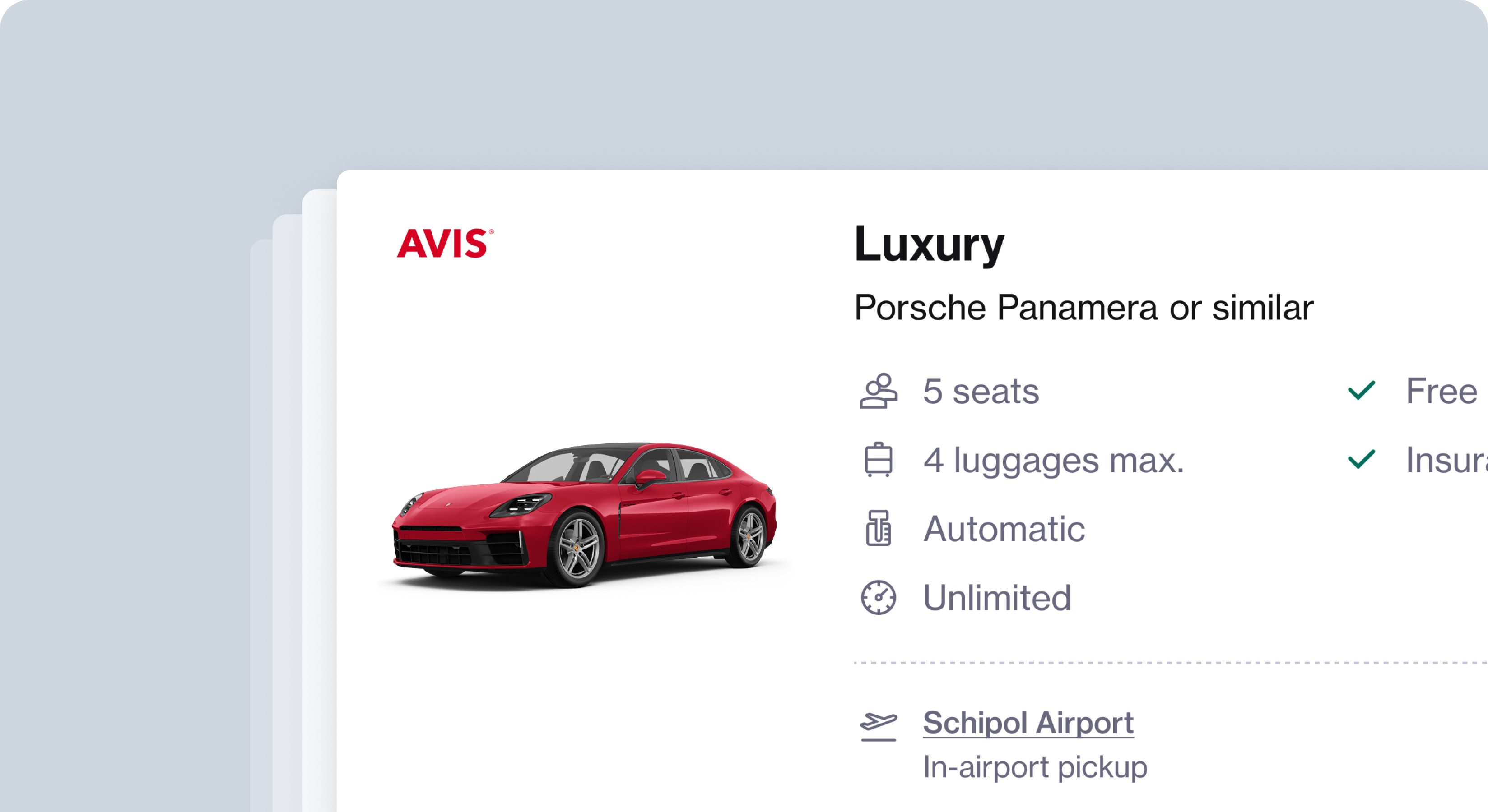
A holistic redesign of the rental car booking experience
Navan is an online business travel management, corporate card and expense management company. I led the redesign of the rental car product to enhance usability, reduce friction in the booking flow and improve overall customer satisfaction.
ROLE
COMPANY
YEAR
Lead Product Designer
NAVAN
2025
CONTRIBUTION
Usability studies, wireframing, prototyping, interaction design, user experience design, interface design for web platform.
INTRODUCTION
“How might we transform a styling update into an opportunity to reimagine the booking journey improving clarity, usability, and trust at every step?”
HMW Statement
The rental car booking platform is a high-stakes touchpoint for travelers, where clarity and confidence directly impact booking decisions. The initial project brief was simple: update map and badge styles to align with the broader design system.
As I explored the experience, I realized that small usability gaps—like unclear location details and inconsistent flows—were causing friction at critical decision points. This insight reframed the project from a visual update into a broader opportunity to improve usability, trust, and scalability. It became clear that a user-centered redesign could have a meaningful impact on conversion and overall satisfaction.
WHY WE BUILT THIS?
Although the original goal focused on visual alignment, I discovered deeper challenges in the booking flow. Key issues included poor visibility of location data, confusing selection states, and inconsistent components across screens. These gaps disrupted decision-making and increased friction for users at the moment they needed clarity most.
The project needed to go beyond cosmetics to create an experience that was clear, reliable, and user-centered. Addressing these issues required a redesign that balanced immediate usability improvements with scalable solutions for future growth.
ROLE
I led the project from discovery to design, expanding the scope beyond the original brief. I conducted a comprehensive UX audit, gathered user feedback, and synthesized insights from internal teams and support data. Based on these findings, I redesigned core interaction patterns to improve location visibility, simplify selection flows, and ensure component consistency.
Throughout the process, I collaborated with product and engineering to balance user needs with business priorities and technical feasibility. I also introduced small, thoughtful enhancements—like contextual alerts and improved selection feedback—to delight users while strengthening confidence in their decisions.
GOALS
- Redesign the information architecture to surface pick-up and drop-off location details more clearly, supporting faster and more confident decision-making.
- Evolve the card and map interaction model into a more seamless, intuitive experience that supports user flow, reduces friction, and aligns with user expectations across devices.
- Modernise map and badge styling to ensure visual consistency and brand coherence across business lines, reinforcing trust and a unified brand experience.
RESEARCH
A styling update uncovered deeper usability gaps.
I conducted a UX audit of the booking flow, evaluating usability, mapping friction points, and identifying opportunities to make key information more visible. I complemented this with competitor analysis, reviewed NPS feedback, support interactions, and spoke with colleagues who had used the tool, ensuring insights reflected real user needs.
These combined methods reframed the project from a styling update into an opportunity to address critical usability gaps and build a clearer, more confident booking experience.
- Heuristic evaluation to identify usability and consistency issues.
- End-to-end journey walkthroughs to map where friction occurred.
- Competitive benchmarking to compare patterns against industry standards.
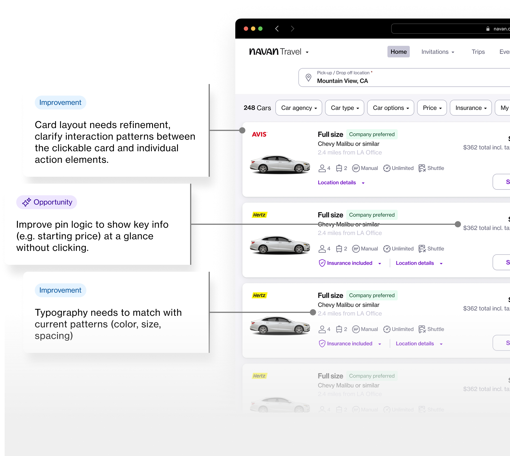
The audit revealed three recurring pain points:
Visibility of location data: Pickup and drop-off details weren’t always clear at decision points.
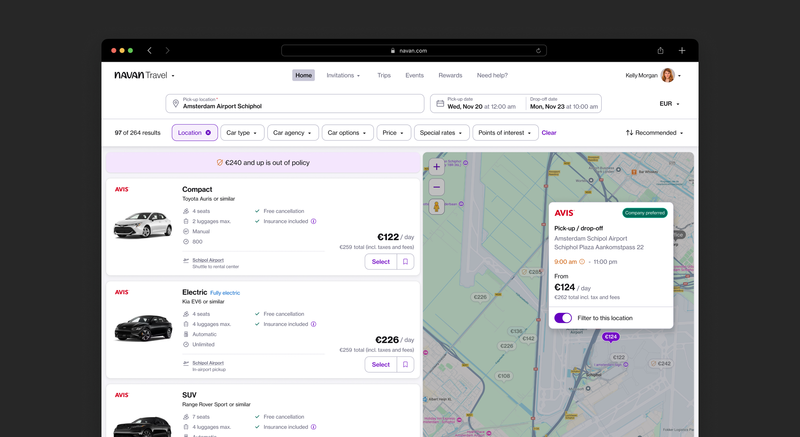
Confusing selection states: Customers weren’t confident whether a choice was applied or still pending. To address this, I improved filter visibility through clear visual differentiation between selected and unselected states on the map. I also introduced a skeleton preloader—even when nothing is technically loading—to create a stronger sense of context change between all results and location-specific results.
Fragmented design patterns: Inconsistencies across screens made the experience feel disjointed.
DESIGN PRINCIPLES
Visible, clear, scaleable...
Visibility
Make key information like pickup locations and availability easy to see.
Clarity
Streamline flows to reduce hesitation and help customers book confidently.
Scalability
Design reusable components that work across products and future iterations.
DESIGN PHASES
Map improvements; changing the information structure
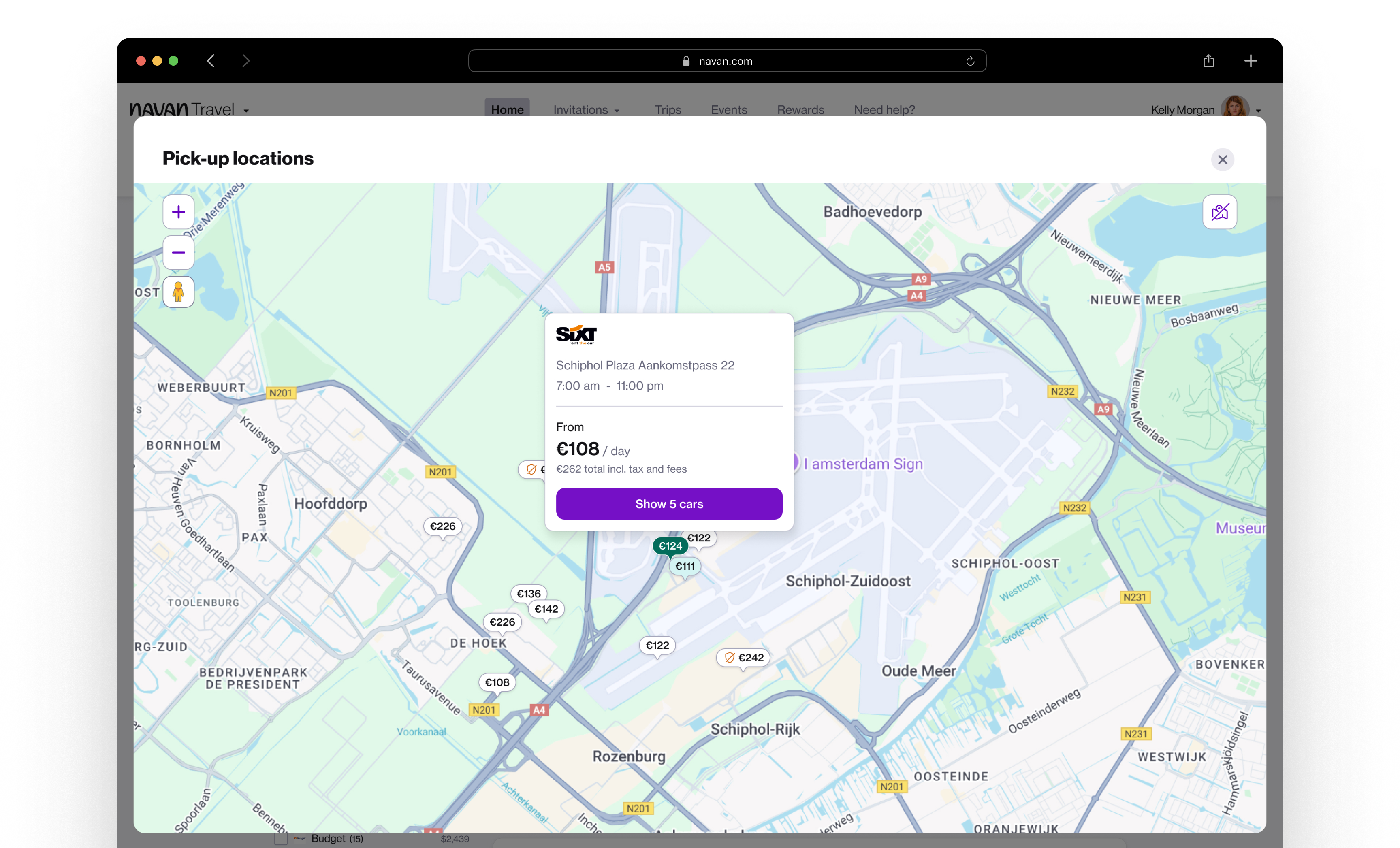
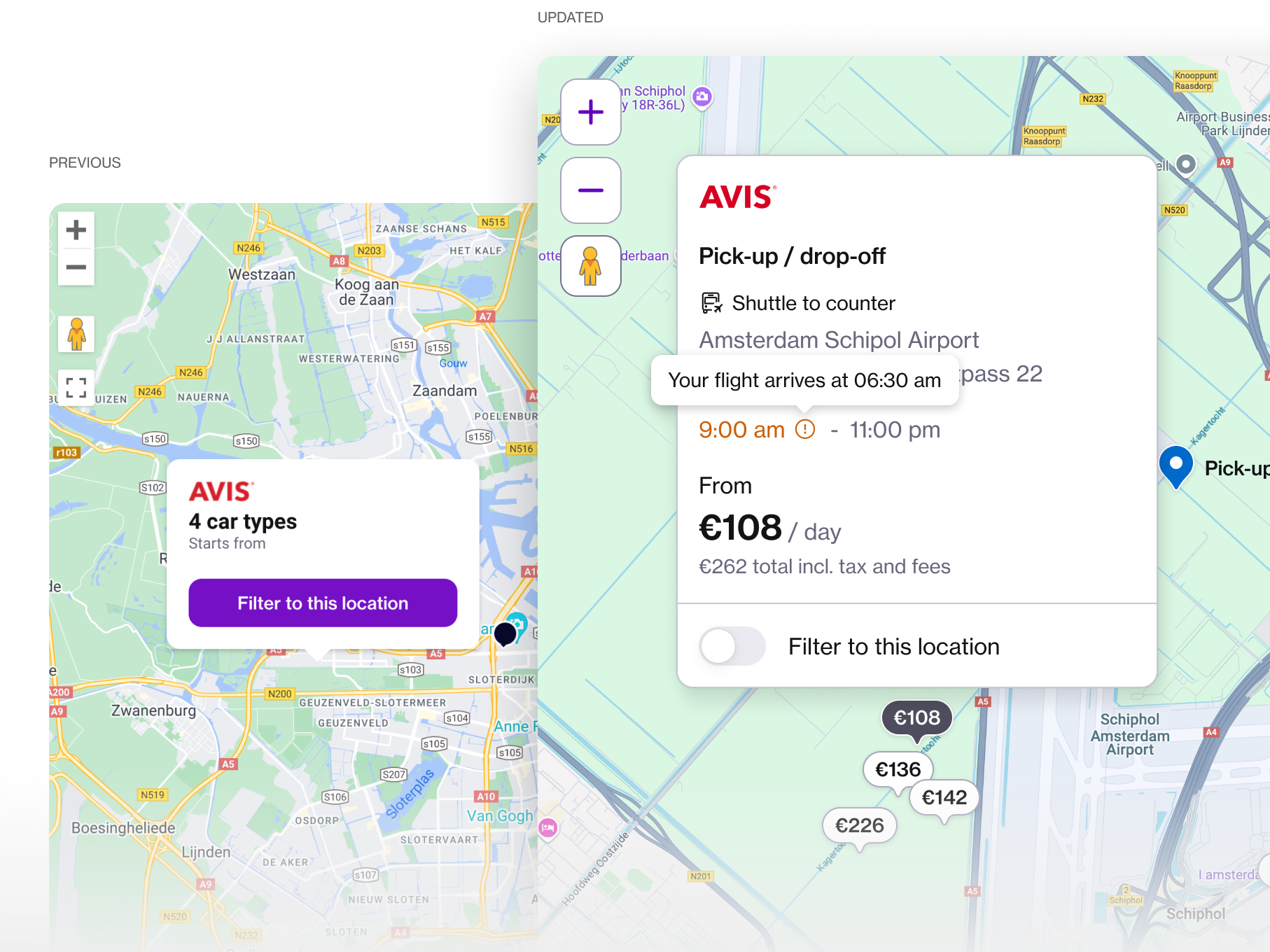
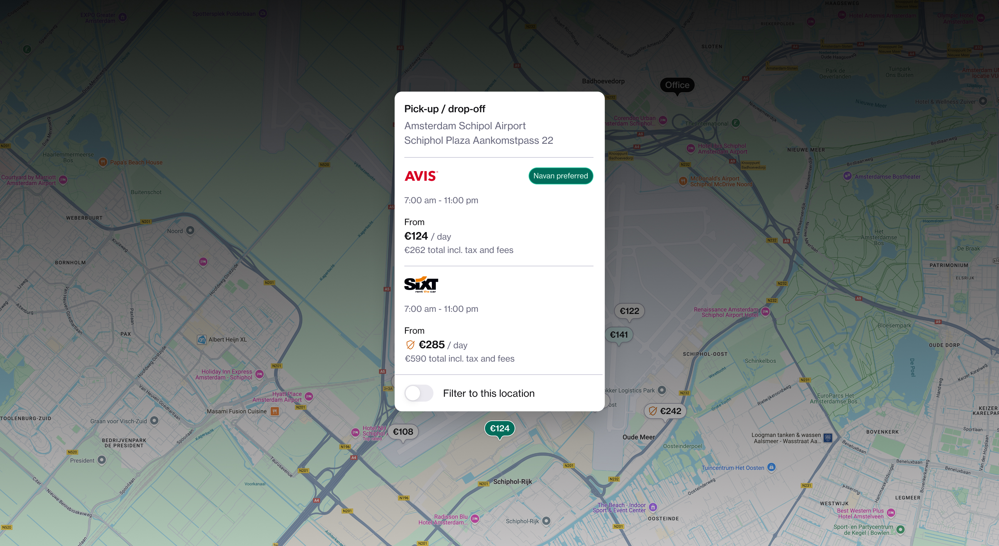
During my research, I uncovered recurring feedback around the lack of clarity in how pick-up and drop-off locations were presented. The location card, which should have helped users make quick, confident decisions, was missing essential information—such as opening and closing hours, address details, policy highlights, and even the starting price. Instead, these details were buried inside option cards, making side-by-side comparison between locations unnecessarily difficult at a glance.
As I worked on improving this experience, I aimed not only to surface critical information more effectively but also to introduce small, delightful touches that could add real value. For example, I explored connecting flight arrival times to the booking flow to give users additional context, and designed critical alerts to notify travelers about long wait times. These enhancements ensured that the redesign didn’t just fix usability gaps, but also anticipated user needs in ways that built trust and confidence in the overall journey.
DESIGN PHASES
SERP cards redesign
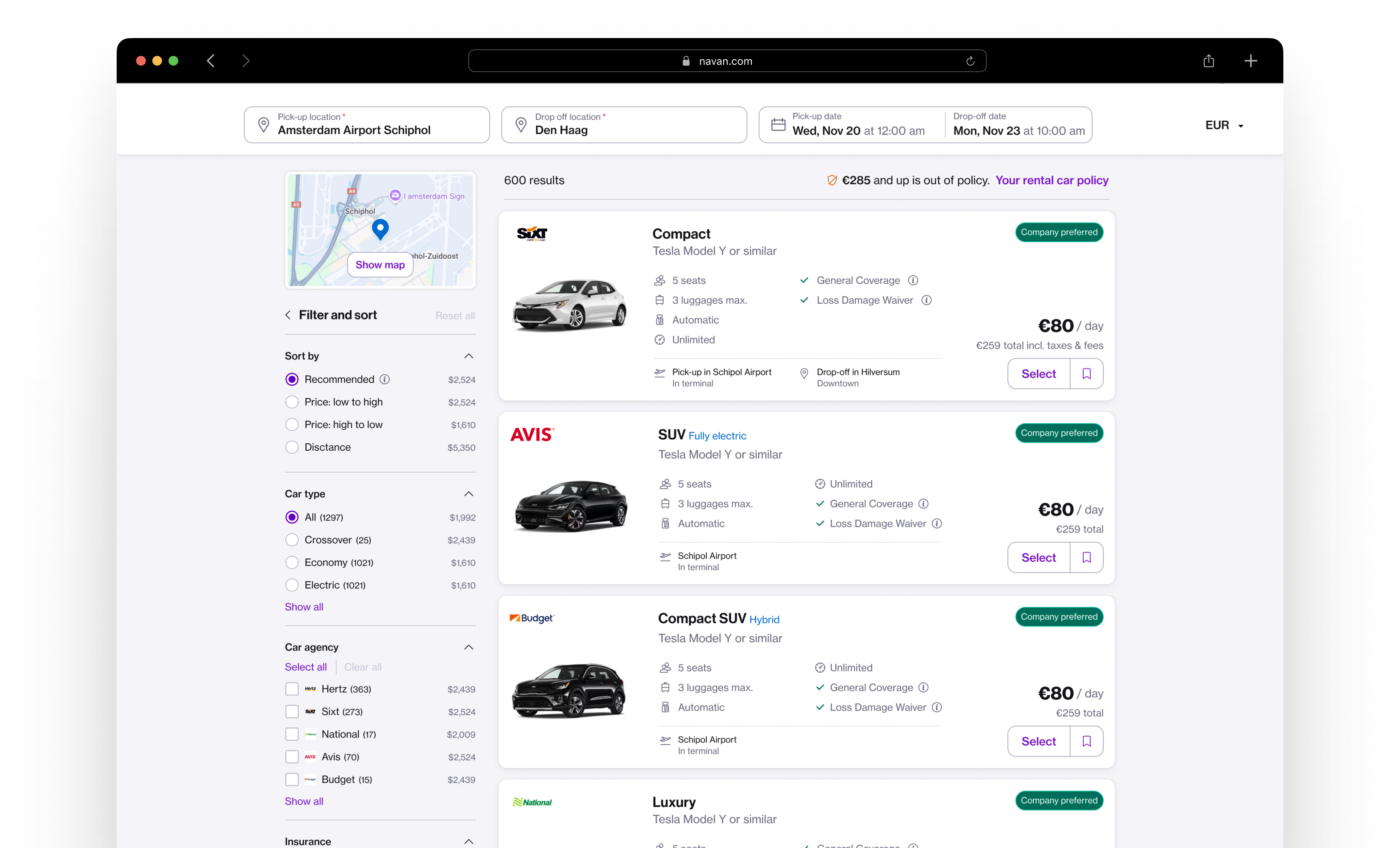
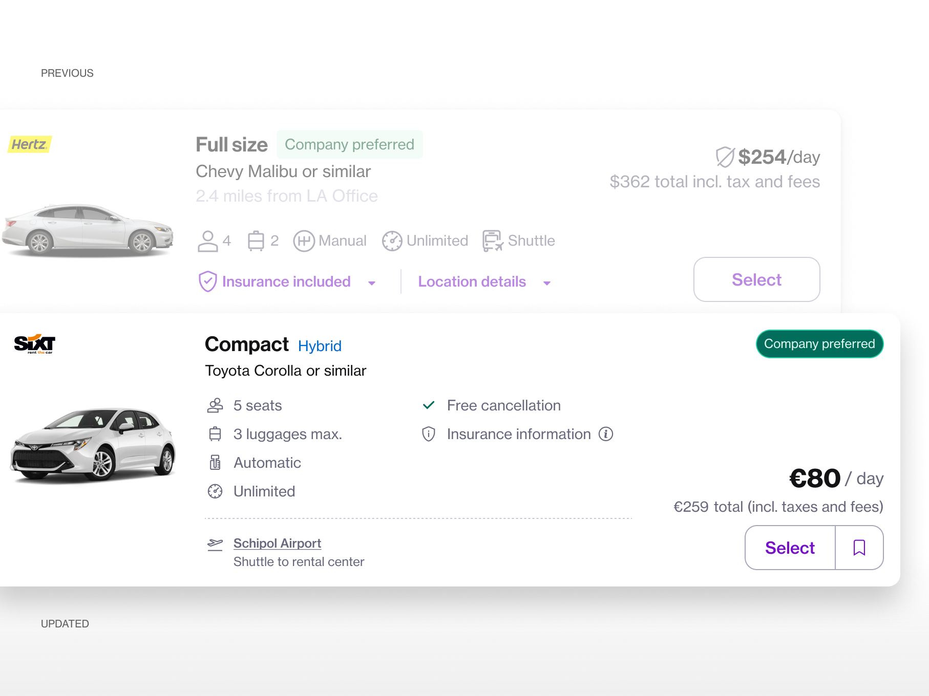
The focus is on redesigning the rental car SERP card to improve clarity, usability, and visual alignment. Key objectives include increasing the visibility of pick-up and drop-off location information directly on the card, enhancing alternative location logic to provide more meaningful options for users, and exploring new interaction patterns such as fully clickable cards with distinct interactive elements.
Additionally, the redesign aims to align the card’s styling with recent improvements made to Hotels SERP cards, leveraging shared components for consistency across products, while updating badge styling to improve readability and hierarchy. Together, these improvements create a more intuitive, informative, and visually cohesive experience for users.
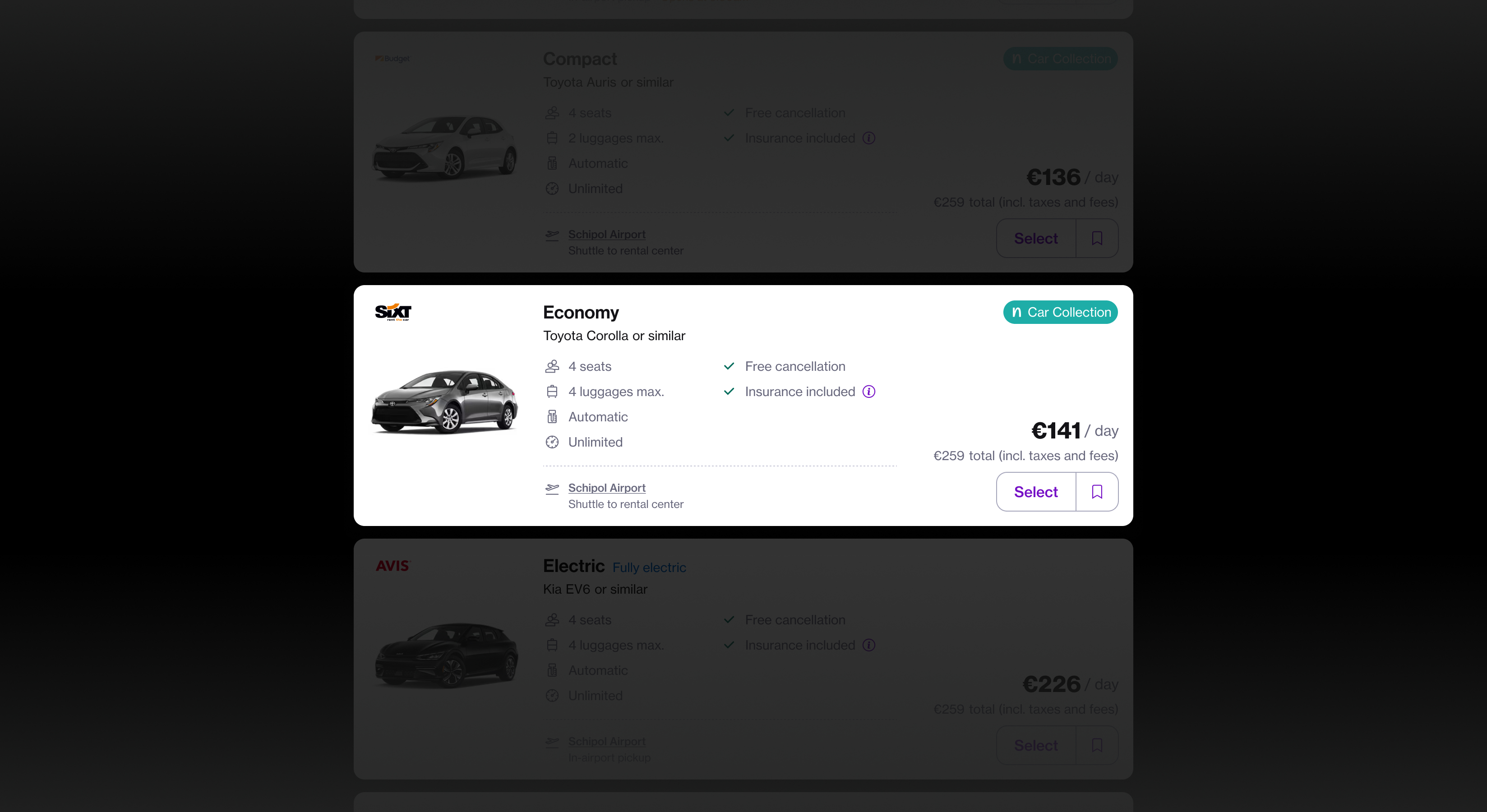
The rental car location component supports diverse use cases from airport pickups to city deliveries and neighbourhood collections. To enhance usability, it’s essential to surface context-specific information: for airport pickups, users need to know if a shuttle is required; for city or neighbourhood addresses, proximity to the exact pickup point is more relevant. Tailoring content to the scenario ensures clarity and reduces user friction.
DESIGN PHASES
Exploring different layouts
During the exploration phase, I tested different layout directions—such as displaying filters more prominently and focusing attention on result cards by hiding the map by default. The goal was to create clearer focus for different user intentions. I questioned whether the map needed to be visible at all times and initially considered removing it altogether.
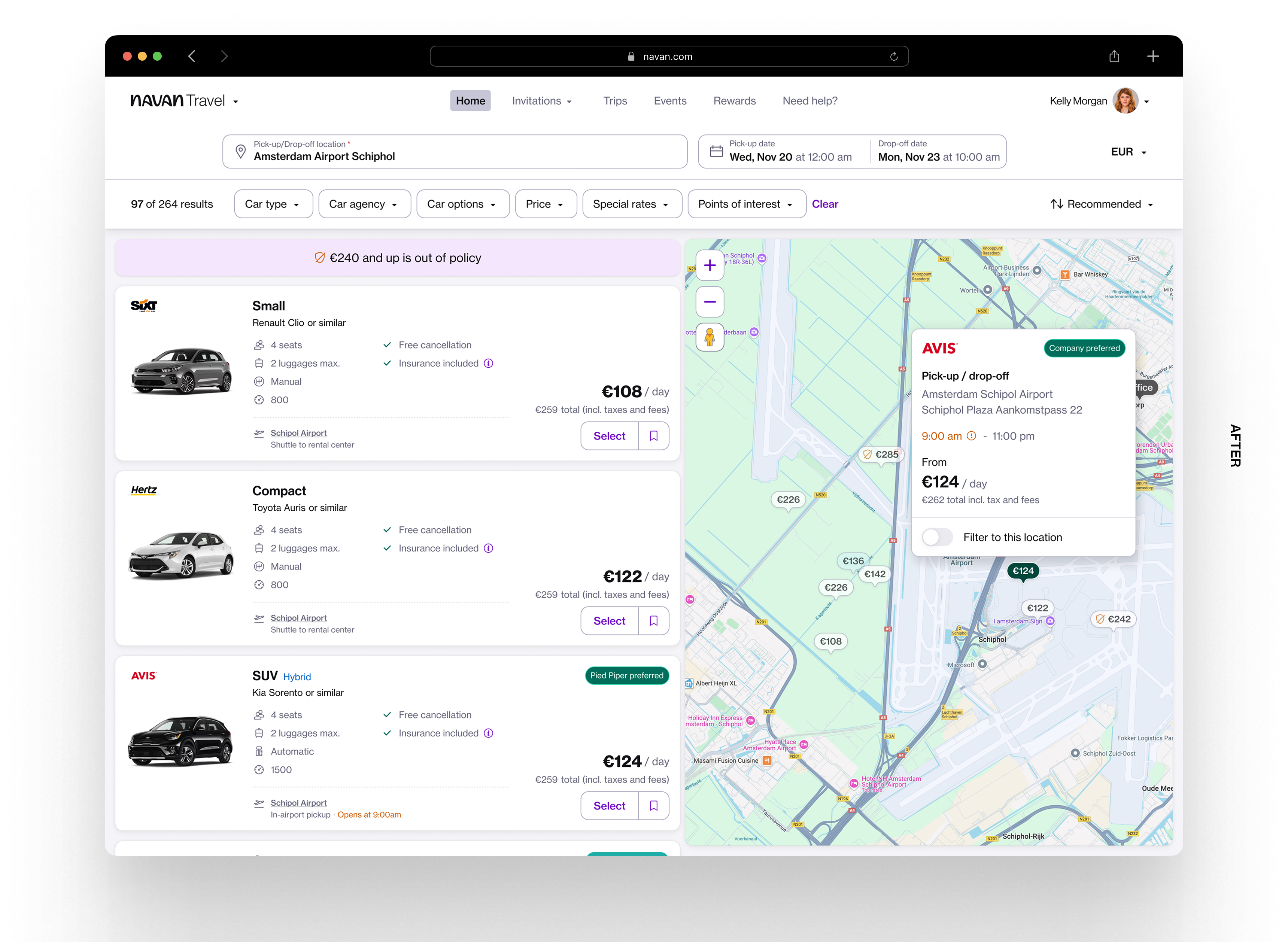
However, through further analysis and discussions, I recognised its strong value for business travelers—especially for quickly identifying company-preferred or out-of-policy locations. Based on that insight, I decided to keep the map visible but focused on strengthening the connection between the map and the results, ensuring they worked together rather than competing for attention.
DESIGN PHASES
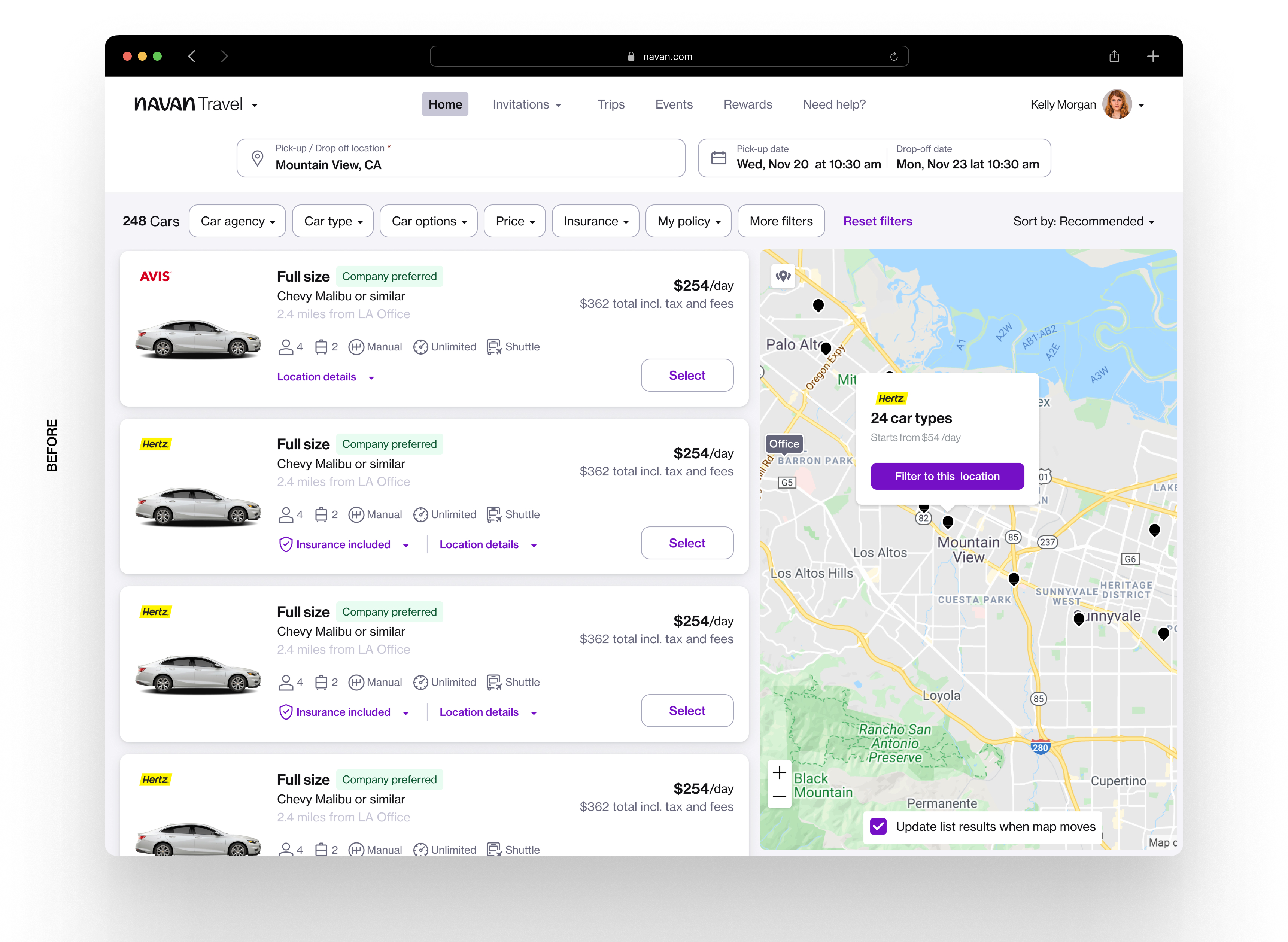
Previous vs final design comparison
IMPACT ON BUSINESS
Following the recent launch of the redesign, we are actively tracking key business and product metrics to assess its effectiveness. Early results show a significant increase in conversion rates and decrease in negative Net Promoter Score (NPS) comments, indicating a positive impact on both user satisfaction and business performance.
KEY DESIGN ELEMENTS
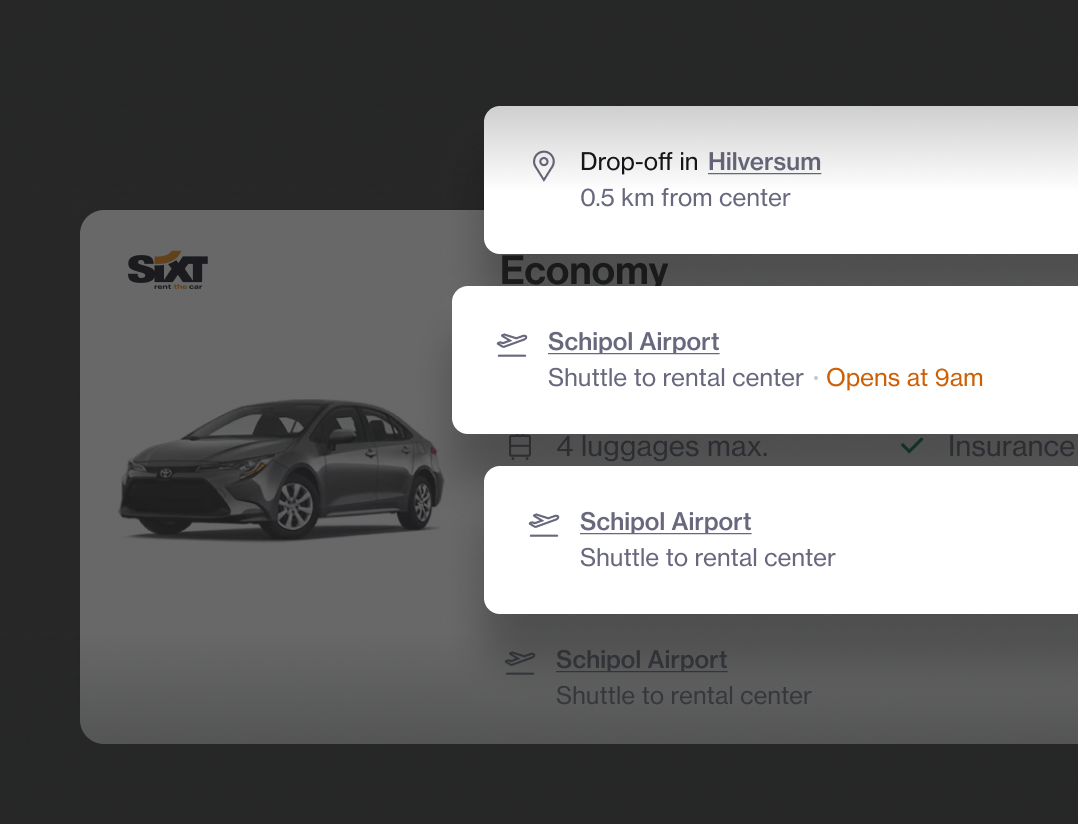
Option card design - location details
The rental car location component supports diverse use cases from airport pickups to city deliveries and neighbourhood collections. To enhance usability, it’s essential to surface context-specific information: for airport pickups, users need to know if a shuttle is required; for city or neighbourhood addresses, proximity to the exact pickup point is more relevant. Tailoring content to the scenario ensures clarity and reduces user friction.
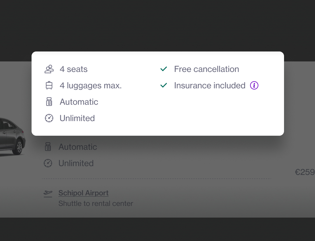
Option card design - smart grouping
I tried to apply a clear information hierarchy by dividing the content into two columns: the left column presents car specifications, while the right focuses on payment terms and insurance details. This structure enhances usability by helping users quickly locate relevant information, while also supporting scalability and predictability as the product evolves.
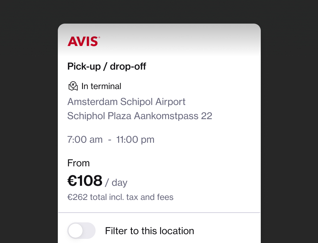
Location card - data restructure
I aim to design the right solutions that support confident decision-making. In the travel space, holistic thinking is essential—every touchpoint connects to a broader journey. With that in mind, we redesigned the layout to highlight key information through a clearer structure and stronger visual hierarchy. We also ensured the new design could scale seamlessly to accommodate different types of content within the same card, maintaining consistency across varied contexts.
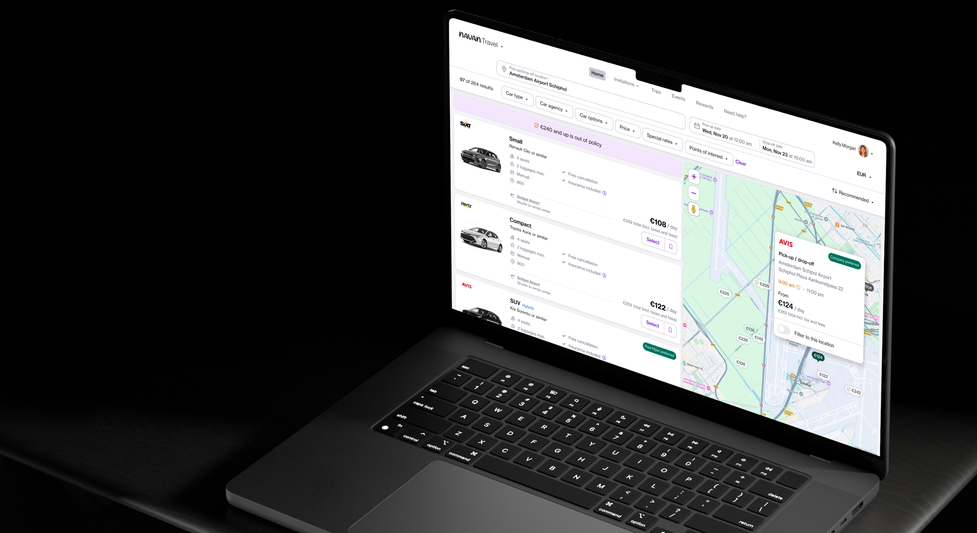
FINAL SCREENS
Based in Amsterdam ⛆
LAST UPDATE, OCTOBER 2025
