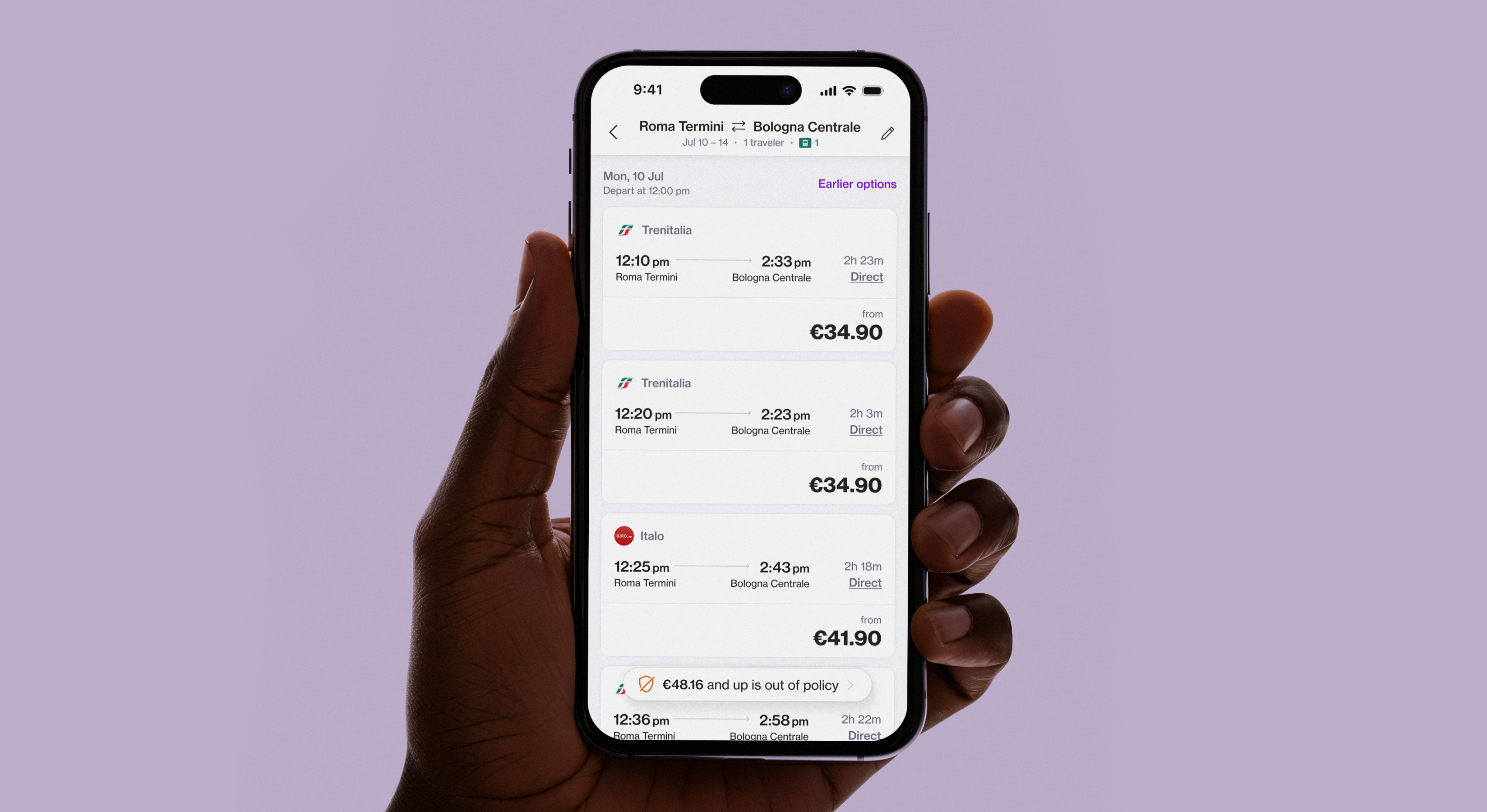
Building 0→1 rail product that now accounts for 20% bookings in the EMEA
Navan is an online business travel management, corporate card and expense management company. I was privileged to design whole trains product from scratch to help company’s growth in EMEA market.
ROLE
COMPANY
YEAR
Lead Product Designer
NAVAN
2019 - 2025
CONTRIBUTION
User research (user interviews, usability studies), wireframing, prototyping, interaction design, user experience design, interface design for web and mobile platforms.
INTRODUCTION
“As a designer, you will be designing a rail platform from scratch”
Tripactions Hiring Manager
This is what I heard before accepting the offer from TripActions in 2019. It sounded intimidating at first, I had only taken a train once in my life and it was going to be my first full-time product design role in a new country.
As a designer, I enjoy challenges because they make you stronger and keep you engaged. But this time was different. I had to quickly gain expertise in the rail product understanding traveler expectations, limitations, and opportunities. To learn, I took as many trains as possible, which gave me real insights. Missing one with my family due to a short transfer was a clear reminder: you need to live the product you design.
Another challenge was earning trust in the product environment. Every decision was questioned unless backed with confidence. This taught me the value of using data, validating ideas through testing, and defending them with solid design reasoning.
Developing a travel product during COVID was tough. Everything felt uncertain, and I knew I had to step up as a designer—taking more initiative, making decisions, and supporting my team. By doing that, we built real trust and connection, facing the unknown together and learning as we went.
WHY WE BUILT THIS?
European travelers needed a simple way to book EU Rail trips on Navan. At first, that sounded easier than it was. Our existing train product just couldn’t scale to meet the needs of new carriers or cover all the requirements of such a complex system. So instead of patching what we had, we set out to build a new rail offering from the ground up one that could handle different providers, adapt to traveler needs and grow with the market.
ROLE
The role was especially challenging as I had to craft a seamless, intuitive user experience while working around fragmented inventory, inconsistent data, and evolving business requirements. My work combined hands-on design with strategic thinking to balance user needs, business goals, and technical feasibility.
In a fast-paced startup environment, I led my team through clear communication, scalable design frameworks, and inclusive collaboration, while addressing complex technical constraints, aligning with diverse stakeholders, and building a solution that scaled to support 95% of European rail carriers.
GOALS
- Design a cohesive user experience that harmonises the unique attributes of diverse rail carriers, ensuring consistency, familiarity, and ease of use for travelers across markets.
- Build a flexible, scalable design and component framework that supports rapid onboarding of new rail partners, accommodating varying technical and UX requirements with minimal disruption.
- Decrease churning customers due to lack of rail offering.
- Grow GBV by expanding rail offering to EMEA region.
DESIGN PROCESS
Double diamond design process framework
I used the Double Diamond framework to guide the design process, shaping it around travelers’ needs for speed, clarity and control. In the early stages, I focused on uncovering and defining the core booking challenges faced by frequent business travelers, ensuring the problem space was well understood before moving forward. I then used the framework’s iterative approach to explore solution concepts, build and test prototypes, and refine the direction toward an MVP. This adaptation allowed me to stay user-centred while ensuring the process remained lean and outcome-driven.
RESEARCH
Travel product research during COVID, ouch!
This phase was a highlight of the project for me. It was challenging, I had to run user interviews and usability studies with my PM (thank you, Natalia!) since we didn’t have a UXR team. Research during COVID made it even harder: travel was disrupted, and people were overwhelmed with calls, leaving little time for extra meetings. Still, these challenges helped me sharpen my research skills as a designer and taught me how to adapt in tough circumstances.
During research phase we interviewed users across three locations (UK, Germany, and France) to gain insights into differing carrier behaviour expectations. Participants were selected to represent three key persona groups: frequent traveler, regular traveler and delegate user. These insights helped us define the MVP scope and prioritise the key functionalities to focus on. I also analysed direct and indirect competitors to identify core user problems and industry-standard patterns essential to the rail booking experience.
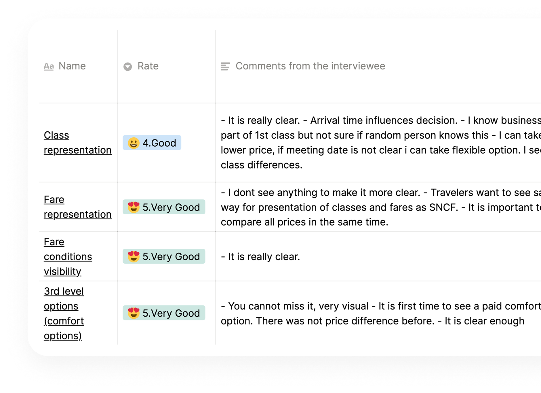
During design phase we conducted usability studies with users to gather insights on the designs and ensure their expectations were met throughout the shopping experience. We created rating framework to focus on each section individually.
Travelers wanted speed, clarity, and control...
Speed: Train travel can often be booked just five minutes before departure, so a seamless and fast shopping experience is essential for travelers.
Clarity: Unclear or inconsistent fare conditions make it difficult to choose the right option. Travelers consistently ask for greater clarity around refund and exchange policies.
Control: Travelers want the flexibility to make comfortable choices such as when and how to travel, selecting seats or managing cancellations/changes.
DESIGN PRINCIPLES
Informative, predictable, simple...
Informative
Showing key details like times, duration, transfers, and prices so users can make confident choices.
Predictable
With consistent layouts and actions so users always know what to expect.
Simple
Helps reduce confusion, showing only the most important information at each step.
DESIGN PHASES
Phase 1 - Designing MVP; UK Rail
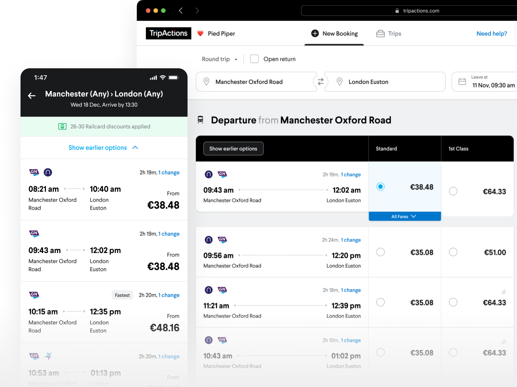
We started with UK Rail (2019), as it was one of the most demanding markets for a rail offering. At the beginning of the project, I traveled to London by train to meet with our partners and gain insights into location-specific user expectations that needed to be addressed in the MVP. My goal was to create a hybrid experience: a shopping flow that felt familiar to generic rail booking, while also incorporating TripActions’ unique shopping patterns. After conducting several usability studies, we were ready to move forward with the accreditation process, which we completed smoothly for each carrier we enabled.
Following the launch of UK Rail, Deutsche Bahn and SNCF came next, and our focus shifted toward building self-serve flows. Each step taught us valuable lessons about adapting to different markets, refining user experiences, and scaling a complex product across multiple carriers.
DESIGN PHASES
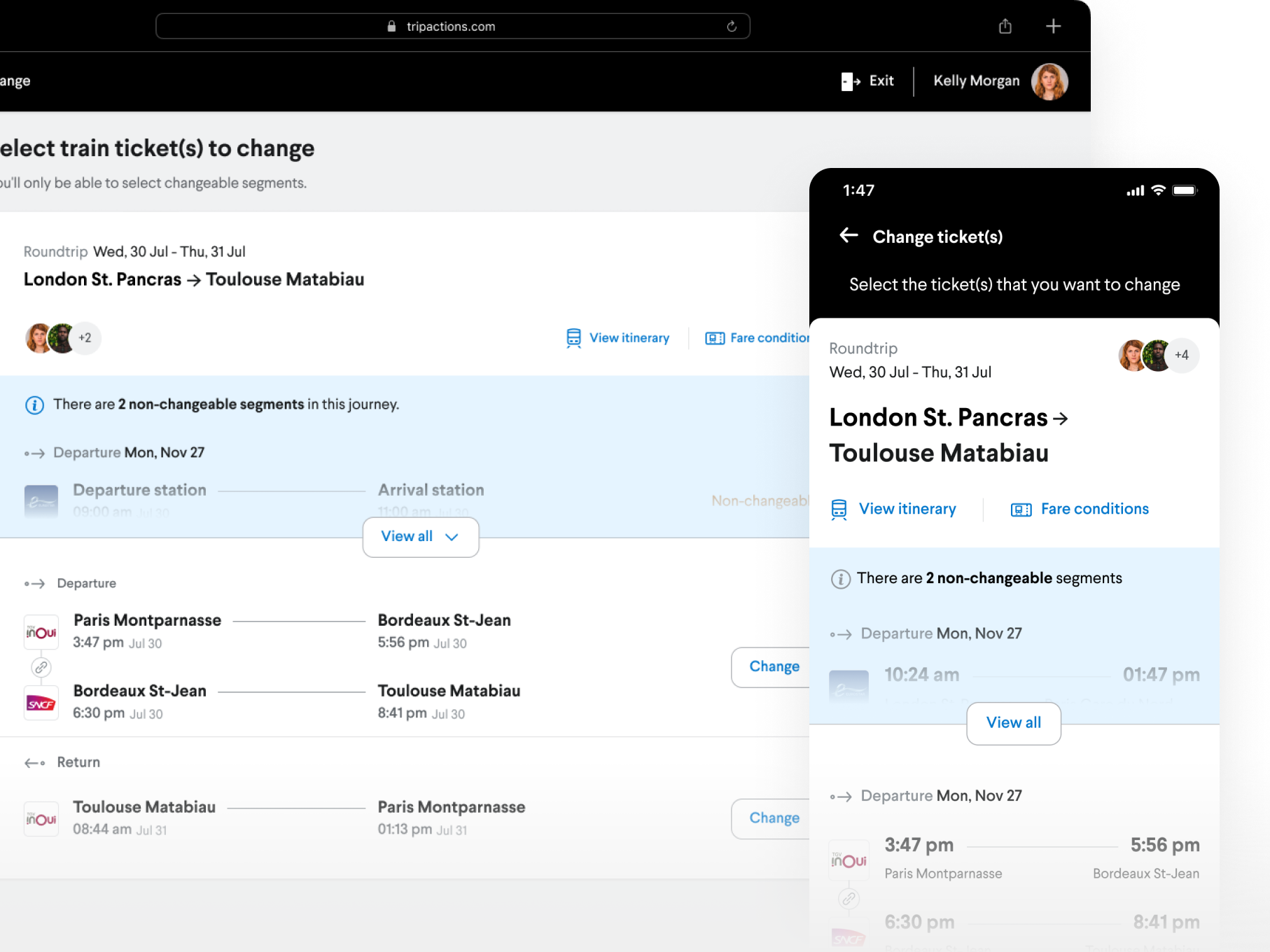
Phase 2 - Designing self serve flows
In the design phase of our trains self-serve flows, we started with in-depth user interviews and iterative testing to identify pain points, prioritize opportunities, and validate usability. Post-launch, we tracked support interactions and drop-off rates to measure impact and uncover where the experience still fell short.
One of the biggest challenges was the messy nature of support topics, which blurred issues like cancellations and exchanges and limited our ability to act on insights. We tackled this by improving categorization tools and training support agents, creating cleaner data streams that empowered both product and ops teams to make sharper, faster improvements. This holistic loop—from research to design, launch, monitoring, and operational refinement—ensured the self-serve flows not only worked, but scaled effectively.
DESIGN PHASES
Phase 3 - Rethinking the shopping flow
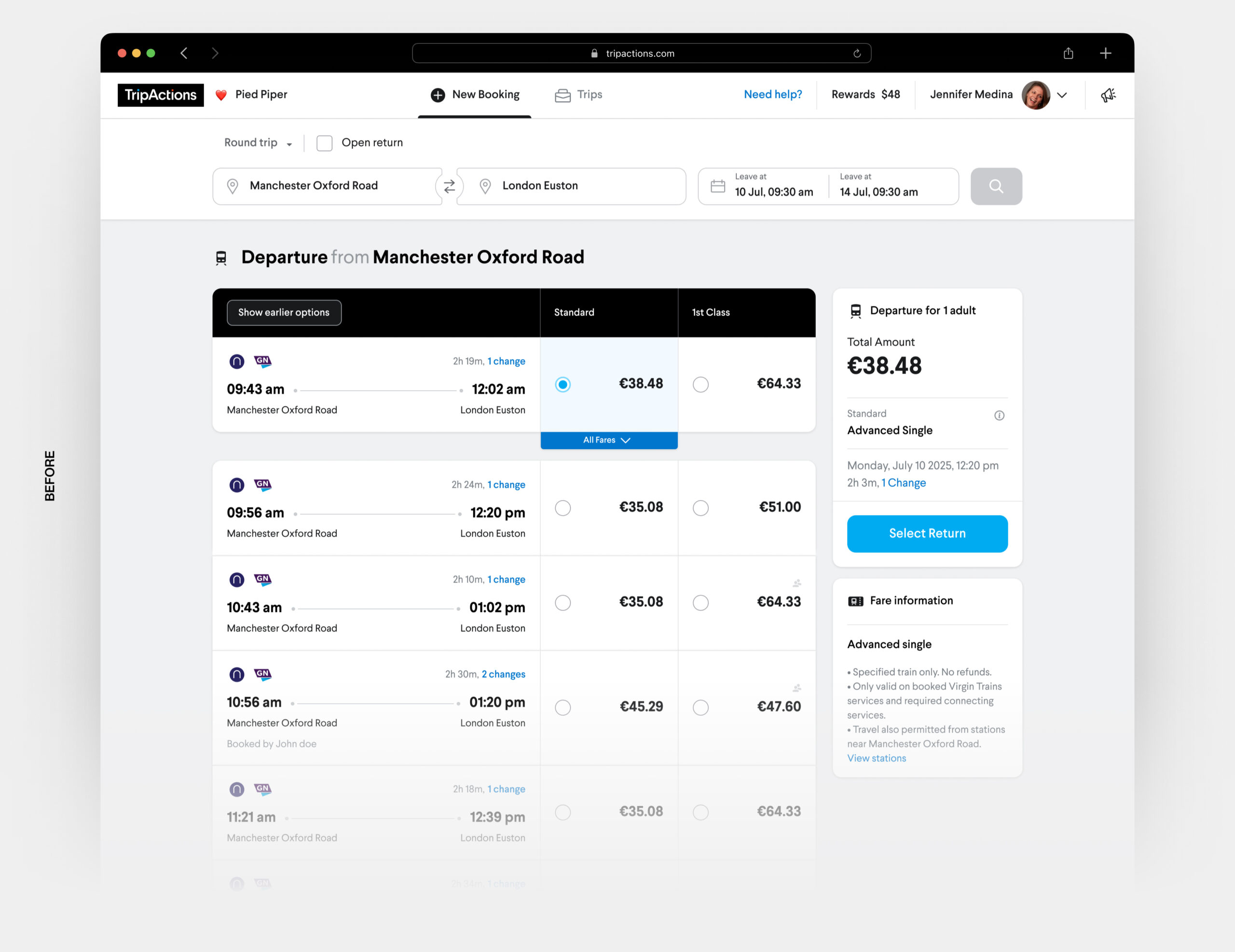
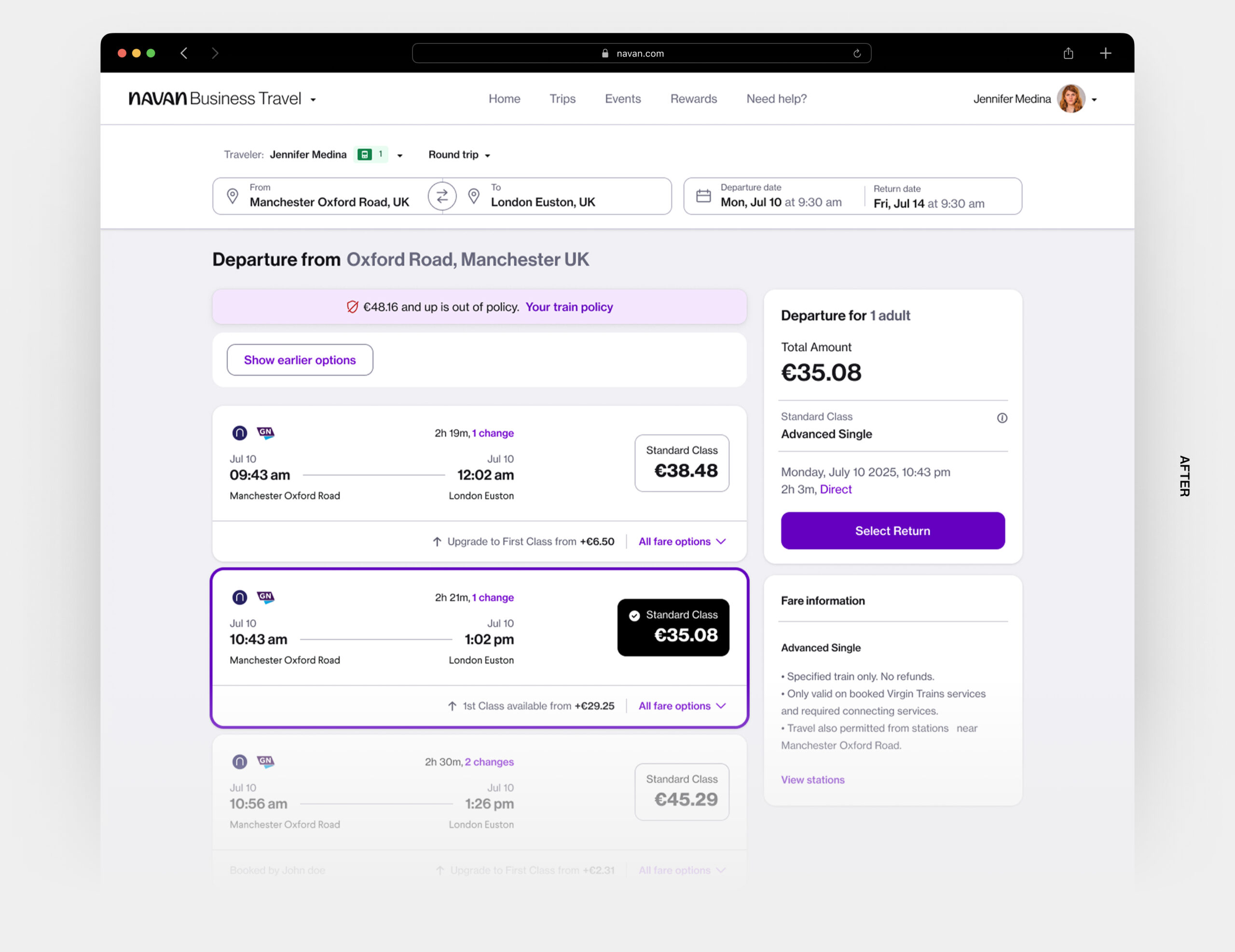
In the third design phase of our trains booking product, we iterated on the previous version with insights from user feedback and data, aiming to refine the experience rather than reinvent it. We identified opportunities to simplify shopping by curating options instead of displaying everything, which improved scannability, reduced cognitive load, and highlighted the most relevant choices within policy.
The earlier layout could only support two classes, limiting scalability as carriers added more variations. Our redesign introduced a more flexible, expandable framework that adapts to carrier requirements while keeping the experience clear and intuitive.
DESIGN PHASES
Phase 4 - Completing missing pieces
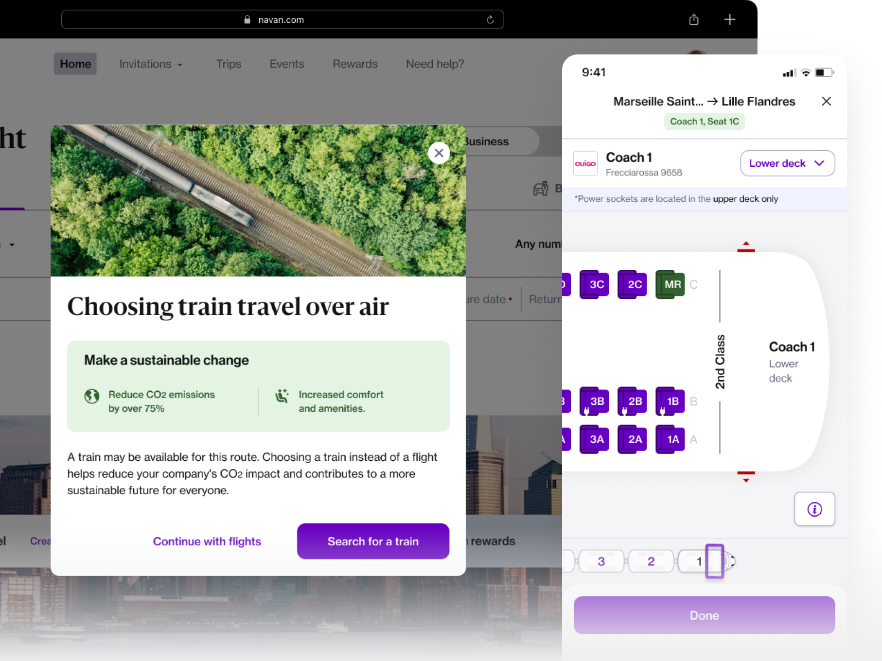
In the fourth phase of our trains booking product, we focused on closing critical gaps by delivering functionalities that users had been asking for seatmaps, automated train cards, rail-over-flights, split tickets and more. These features were not only essential to creating a more complete and competitive offering but also to ensuring travelers could manage the entirety of their journey within Navan, instead of relying on offsite channels or support.
By addressing these gaps, we reduced booking leakage, lowered support interactions and elevated the end-to-end travel experience to meet industry leading standards. This phase was about more than feature delivery, it was about positioning Navan as a serious player in the rail market and driving meaningful improvements across both user satisfaction (NPS) and business impact (GBV).
DESIGN PHASES
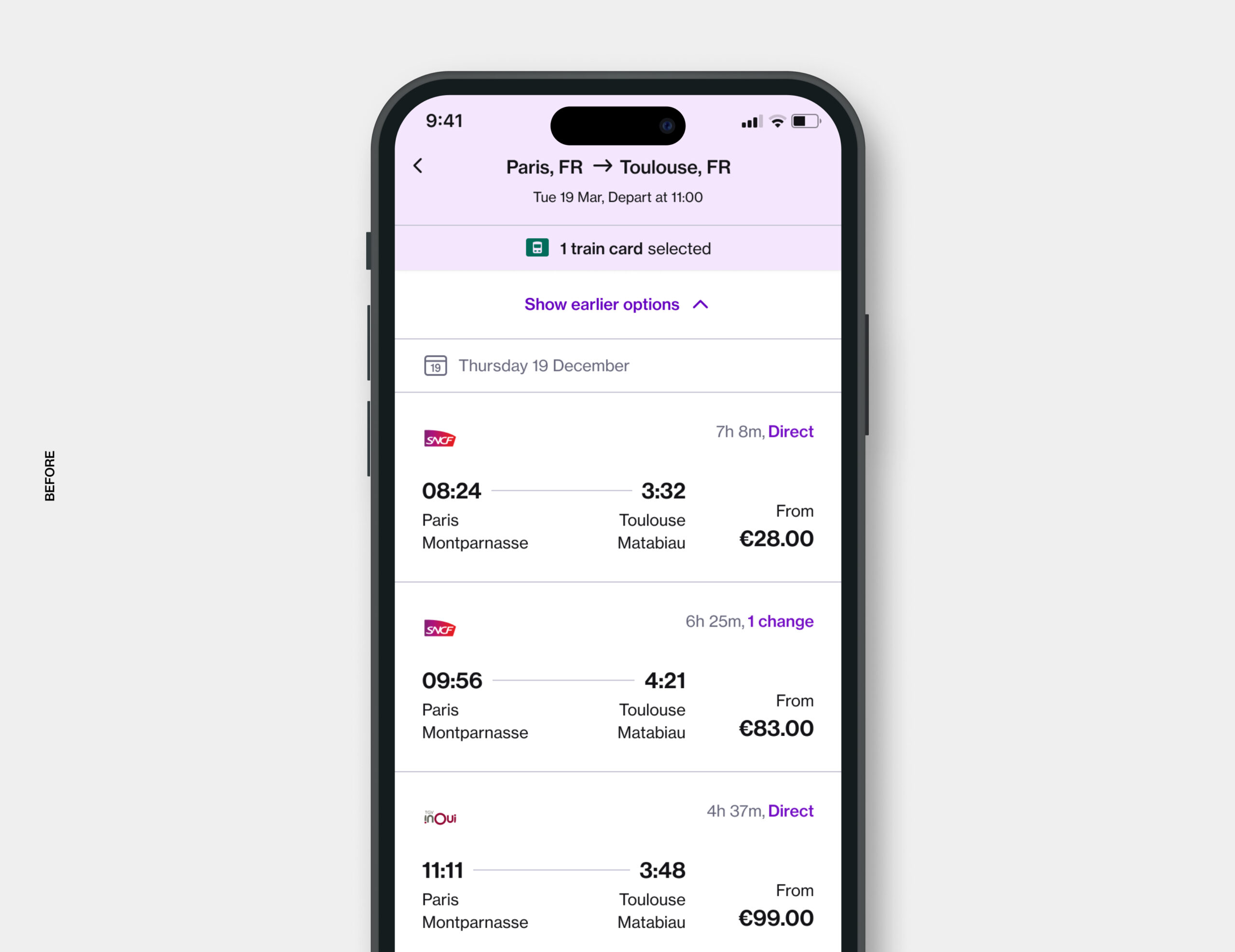
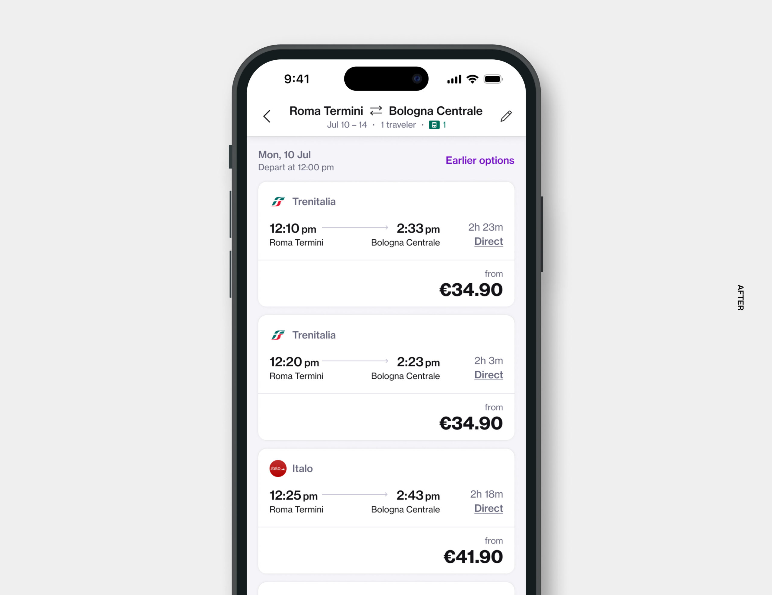
Phase 5 - Shopping flow mobile redesign
For the mobile redesign, I worked closely with the flights design team (special thanks to Cem) to align overlapping components and interactions across trains and flights. One of the main challenges was reconciling different product conventions and user expectations: trains and flights had unique flows, terminologies, and priorities, which made finding common ground non-trivial.
Through multiple iterations, we designed solutions that could work seamlessly for both lines of business, establishing unified interaction patterns and a more consistent mobile experience across travel products. We facilitated joint design critiques, collected feedback from both teams, and iteratively refined our proposals. These sessions were key to building consensus and earning buy-in from stakeholders across LOBs.
Beyond the product itself, this collaboration influenced company-level design processes: by documenting and sharing our cross-LOB methodology, I helped define a replicable approach for unifying components and interactions across multiple business lines, reducing redundancy, and increasing efficiency in future projects. This effort not only improved consistency for users but also strengthened alignment between product teams and design operations at a strategic level.
IMPACT ON BUSINESS
The rail product quickly became a key component of our platform, driving significant user engagement and contributing meaningful growth metrics.
20%
Now processes 20% of all EMEA bookings each month and keep increasing.
↑50%
Increasing its Gross Booking Value (GBV) by approximately 50% year over year.
50k+
Processes more than 50k bookings globally per month.
KEY DESIGN ELEMENTS
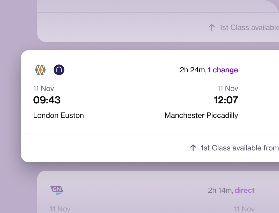
Option card
The role was especially challenging as I had to craft a seamless, intuitive user experience while working around fragmented inventory, inconsistent data, and evolving business requirements. My work combined hands-on design with strategic thinking to balance user needs, business goals, and technical feasibility.
In a fast-paced startup environment, I focused on guiding my team through clear communication, scalable design frameworks, and inclusive collaboration at every stage of the design process.
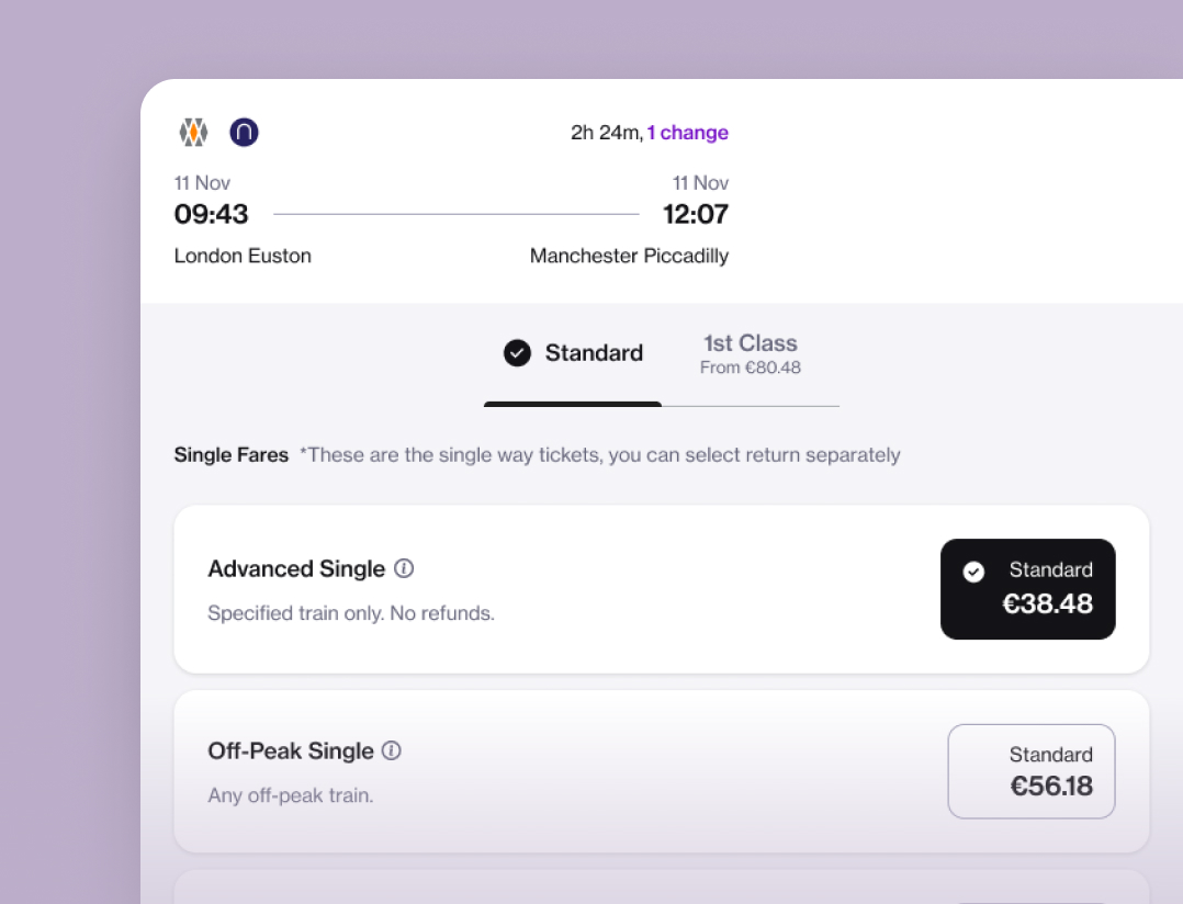
Fare options
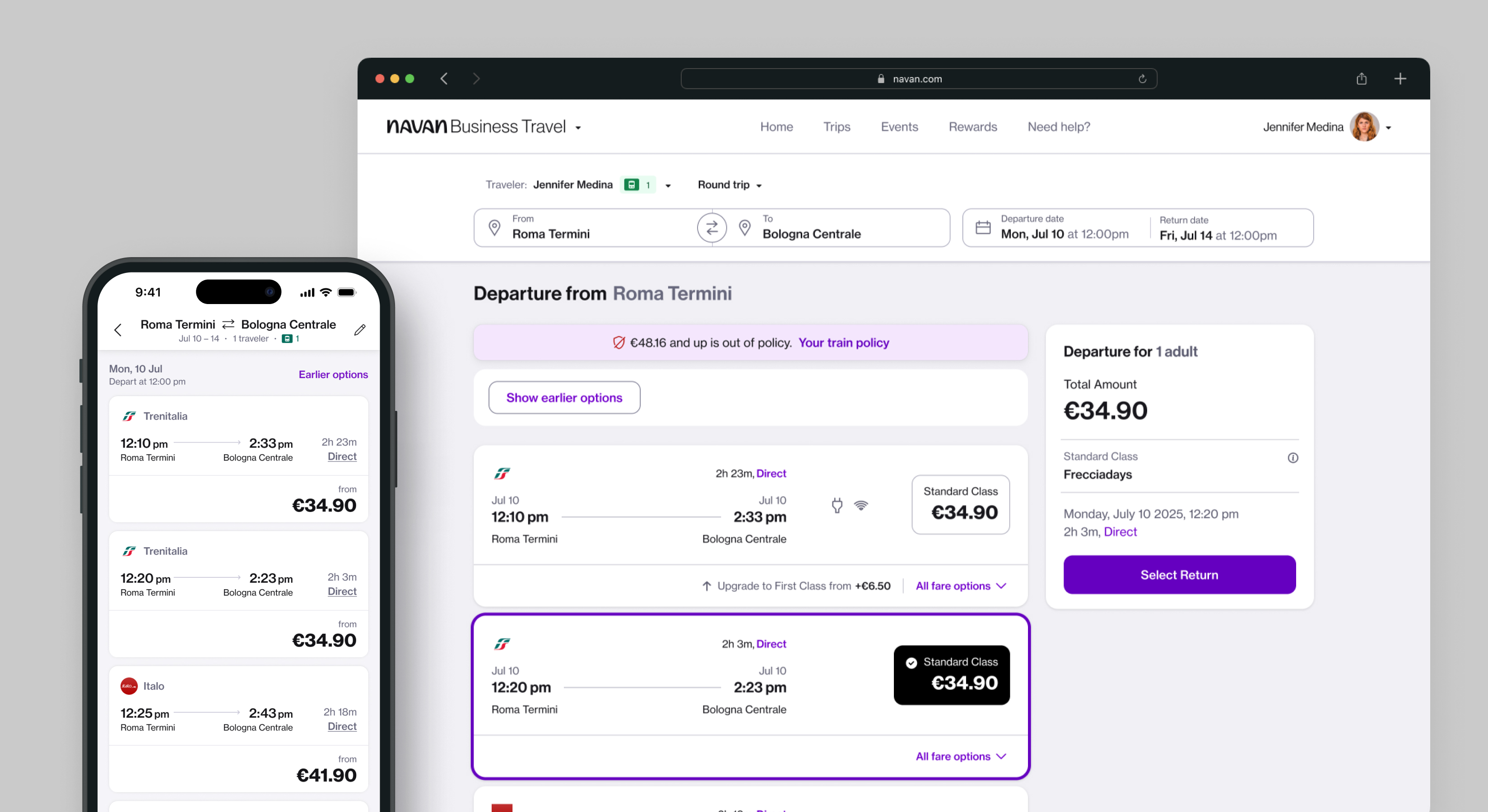
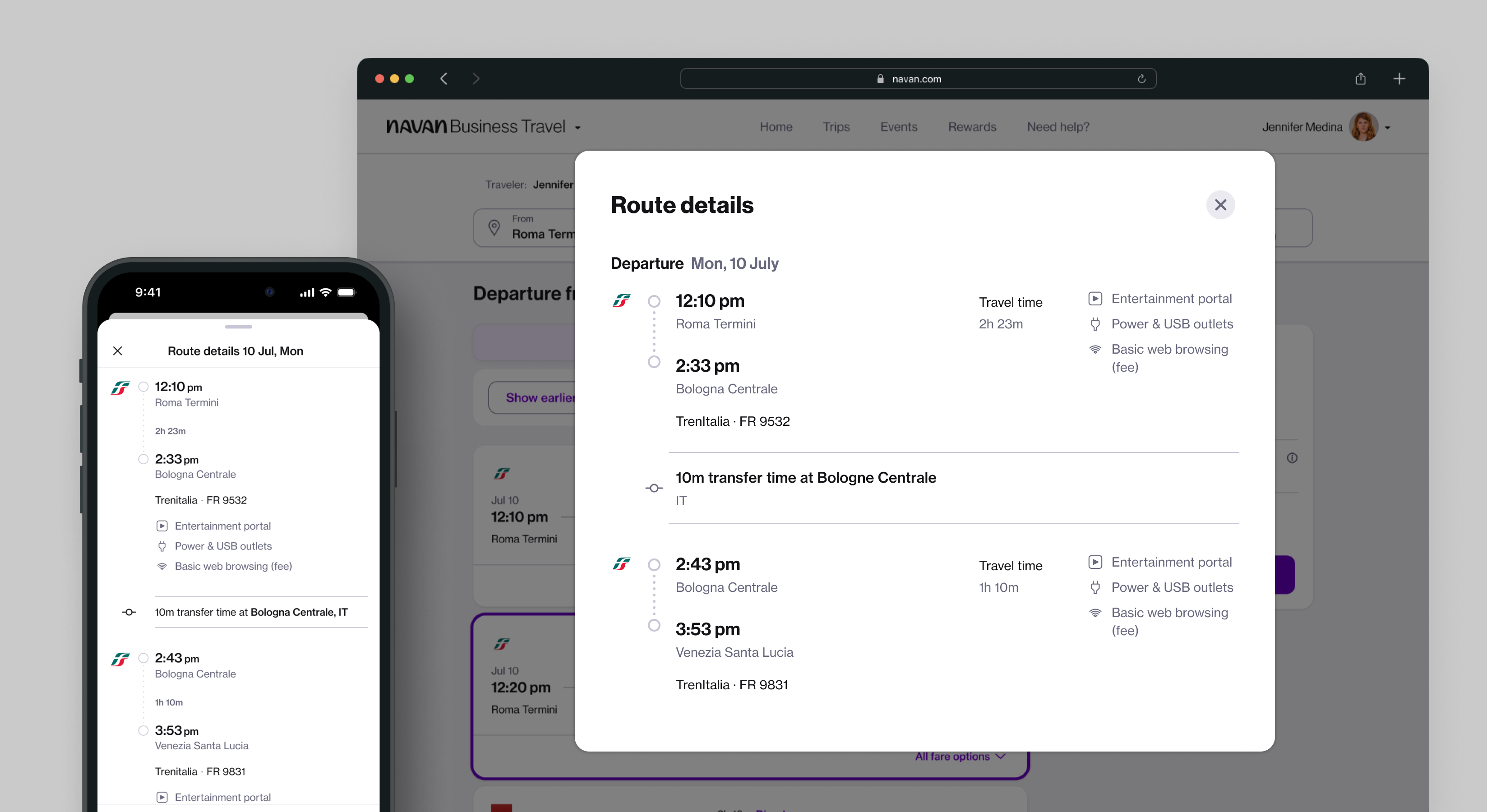
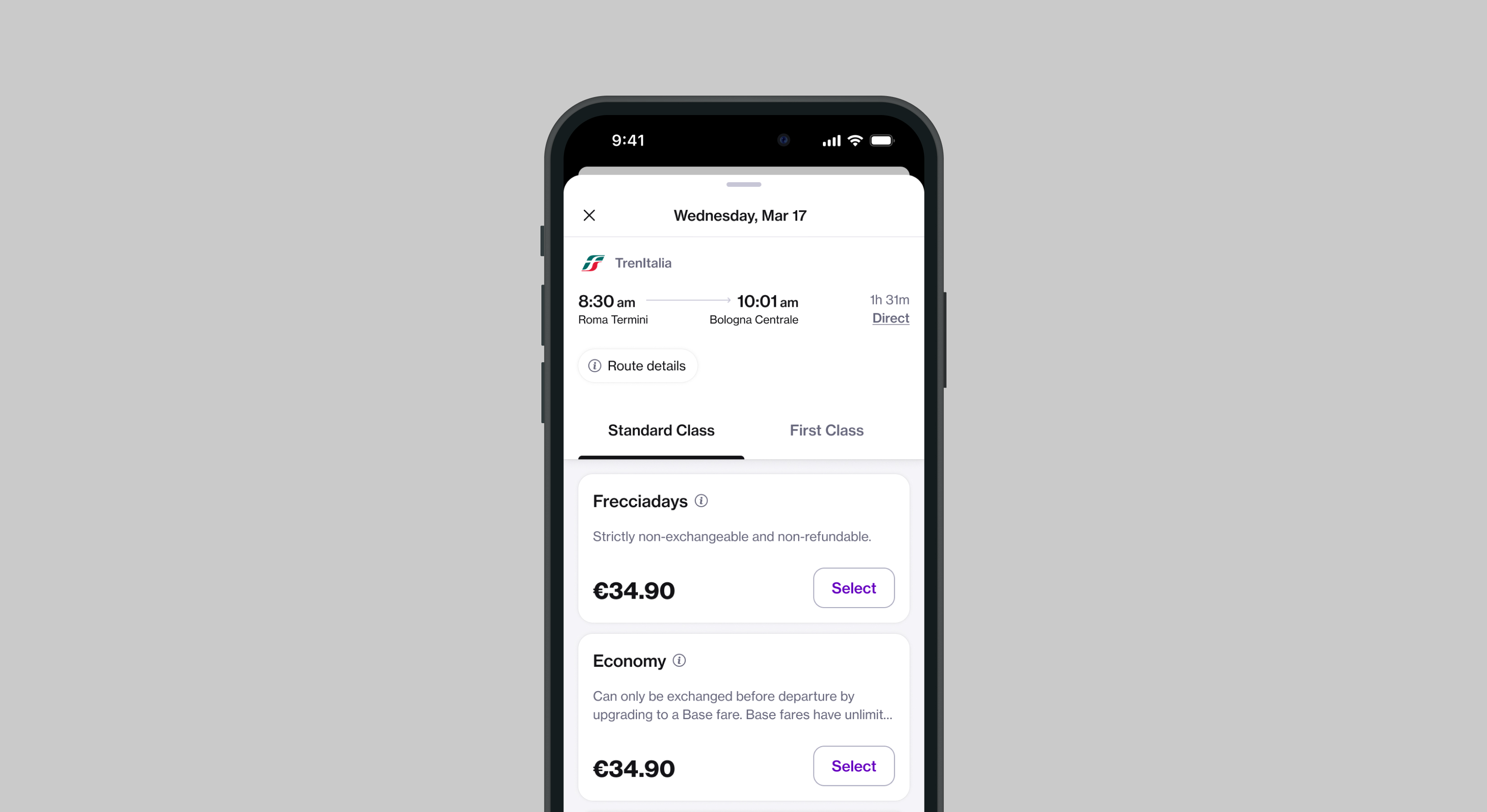
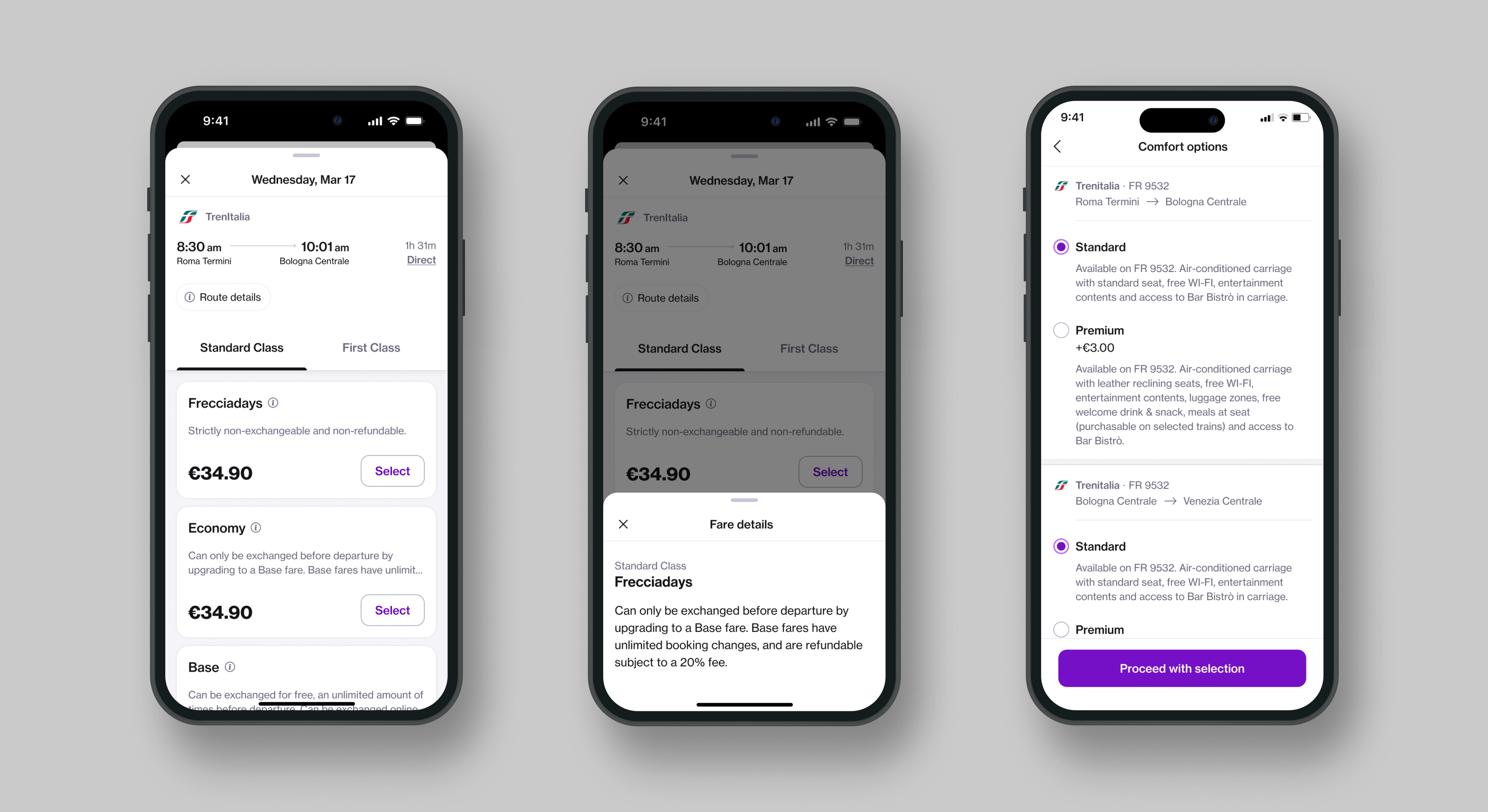
Class information is a key factor in traveler decision-making. We aimed to clearly distinguish between travel classes while incorporating an upsell strategy by showing price differences to encourage informed upgrades. Since fare details vary across carriers, it was crucial to design a flexible, scalable information structure that could adapt to different data sets and support localisation needs.
During the design phase, I stress-tested user flows with multiple languages to ensure layouts remained robust and nothing broke due to text expansion or localisation differences.
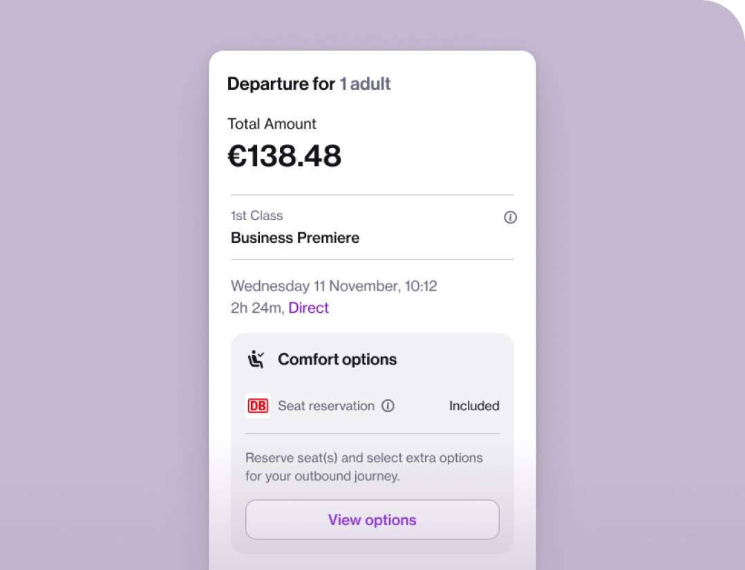
Side bar
As part of the MVP scope, we aimed to keep the experience as simple and efficient as possible. To support this, we introduced a “pre-selected option” approach automatically highlighting the best travel option based on key criteria, allowing users to proceed with a single click. To support this interaction, we implemented a sidebar displaying all relevant details about the selected option.
While this pattern differed from what we used in other lines of business, it was already common in the rail industry at the time. We tested both approaches (with and without the sidebar), and usability testing clearly showed that the sidebar significantly improved clarity and ease of use for travelers.
FINAL SCREENS
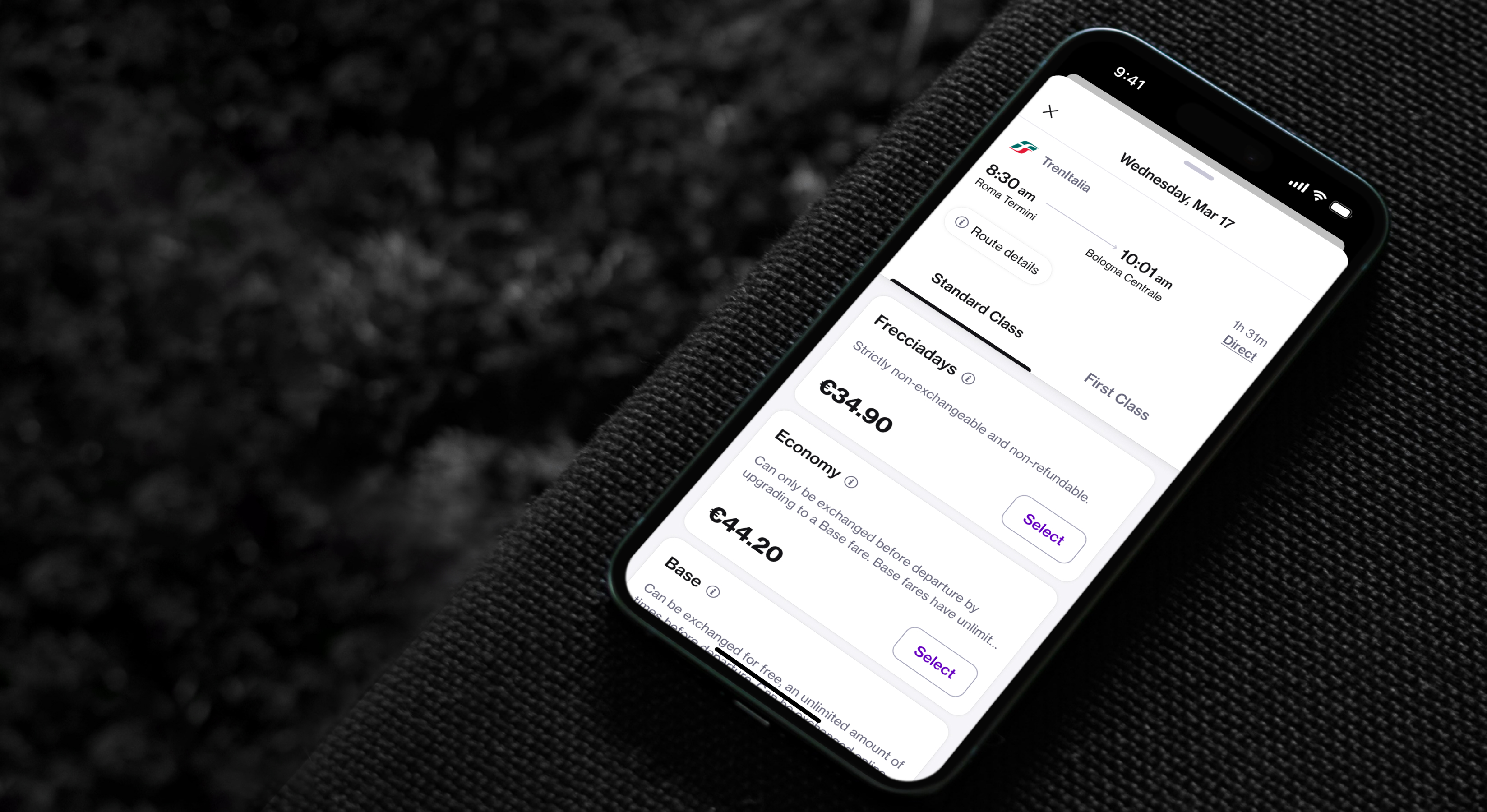
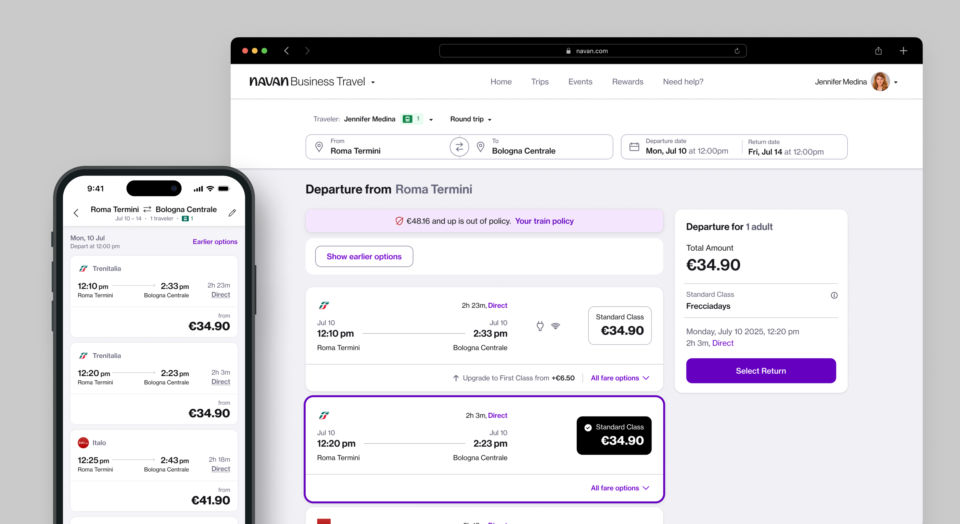
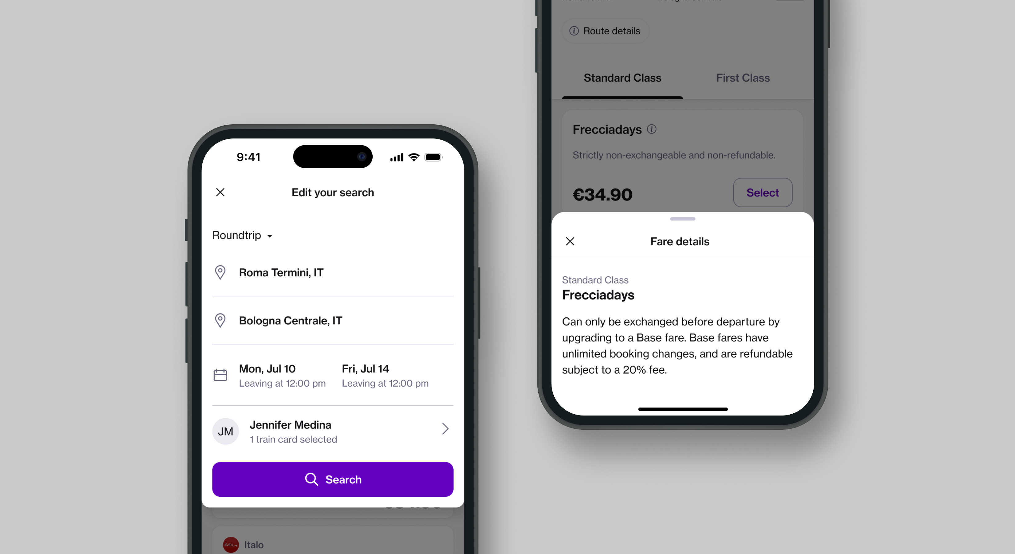
Based in Amsterdam ⛆
LAST UPDATE, OCTOBER 2025
